So! First
class, slide show!
Annette
Messager
It is
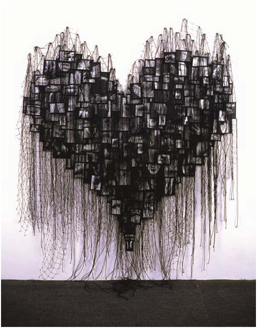
almost impossible to consider photography installation without looking into the
work of Annette Messager, a French artist who utilises the medium in a number
of her works. Many artists who use photography struggle with the mediums
invisibility, the problem that photos are generally looked through, rather than
at, the viewer seeing a person rather than a picture of a person. This doesn't
seem to be an issue that Messager has had too much trouble with, given the
sculptural nature of her photographic installations.
Both of
the works below are comprised of many small framed photographs hung together
with string. In such a display the individual photographs become less important
than the volume and the overall impression.
Beat
Streuli
Beat
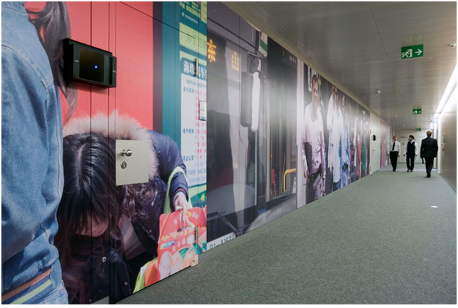
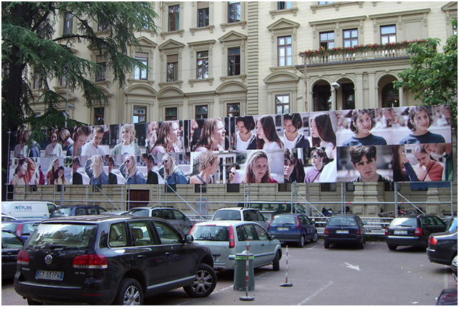
Streuli focuses much of his attention on the street, his exhibitions often
comprised of oblivious people, cars, signs, and many other brightly coloured
examples of twenty first century streets. Over the years this subject matter
has changed very little, but his display methods can be quite varied. Streuli
often uses public spaces such as airports, office buildings, and fences,
putting his images of the public back into a public sphere. Another common
feature in his installations is size, the images are often larger than life,
and a number of times her has displayed them as huge transparencies on windows
such as those in Chicago's Museum of Contemporary Art.
Banque Pictet, Geneva, 2009 - Wallpaper installation, 2,50 x 50 meters
('Untitled', permanent installation, 2009)
Museu
d'Art Contemporani, Barcelona, 1998 - Translucent prints mounted on acrylic
glass ('Plaça dels Angels', 1998)
Museum of
Contemporary Art, Chicago, 1999 - Translucent prints mounted on acrylic glass,
300 x 300 cm each ('Chicago Portraits July 99', 1999)
Outlook,
Athens, 2003 - 50 digital prints mounted on wall, ca. 110 x 160 cm each
('Athens April 03', 2003)
ARGE
Kunst, 'consens', Bolzano, 2006 - billboard, 3.60 x 27 m (Travelers, 1997)
Murray
Guy, New York, 2006 - Digital prints mounted on walls, 2.40 x 15 m ('Brussels
05/06', 2006)
Beat
Streuli's website is here and he has
a prodigious number of installations on there from 1996 to last year.
The
Bechers
Bernd and
Hilla Becher are worth looking into if undertaking any form of topographical
series. Their documentation of similar buildings, including water towers
(below) and other industrial buildings needed a mode of display that suited the
orderly fashion with which they had been chosen and framed. The grid is a
classic way to display series such as these. The exhibition method is
appropriate to the overall work in its use of visual filing.
Bill
Viola
Bill
Viola is probably the only artist here whose work I have seen in person. His
work, The Messenger, which videos a man sinking and surfacing in a huge depth
of water was exhibited at The Dowse in 2010.
Viola
does a lot of work with video installation, much of which is site specific.
Bill Viola: The Messenger, 1996. Video/sound
installation. Photo: Kira Perov
‘the veiling’, 1995- video still
Here the
video is projected through thin layers of material, layering the image and
giving it an ethereal quality.
Viola's Website is here
Douglas
Gordon
For this
work Gordon had an Elephant brought into the studio where she was filmed in
various poses, as her trainer directed her. The footage where then silently
played on a number of screens inside the same gallery.
I'm not
really sure how I feel about this work, I think it would be visually very
impressive, and conceptually it is interesting, but something about treating
and elephant this way really doesn't sit well with me. the use of different
screens displaying different angles, and the small TV showing the close up of
the eye is effective.
Douglas Gordon
Play Dead; Real Time
Installation view
2003
at Gagosian
Play Dead; Real Time
Installation view
2003
at Gagosian
"The tape, which is a series of circling shots, has been edited so
that there are regular fades to black. Each time the scene resumes, Minnie is
lying down (the monitor's segments always start with a close-up of her eye).
This gives Play Dead a rhythm and an unconscious storyline.
Minnie lies down and we wait for her, pull for her, to get up. This rising
turns out to be a fairly remarkable, freaky sight. Once she's up, the camera
resumes circling her like some classically trained hyena. When the viewer
circles the screens, the whole scene turns slightly vertiginous. " Elephant Man
by Jerry Saltz
Andreas
Gursky
While I
managed to find a number of Gursky's images (unsurprisingly, this is not
difficult) I can't seem to track down any documentation of his work on gallery
walls. Having not seen any myself, Jenny has assured us that they are large
scale prints.
Andreas
Gursky. 99
Cent. 1999.
Chromogenic color print.
6 ' 9 1/2" x 11' (207 x 337 cm).
Lent by the artist, courtesy Matthew Marks Gallery, New York, and Monika Sprüth Galerie, Cologne
© 2001 Andreas Gursky.
Chromogenic color print.
6 ' 9 1/2" x 11' (207 x 337 cm).
Lent by the artist, courtesy Matthew Marks Gallery, New York, and Monika Sprüth Galerie, Cologne
© 2001 Andreas Gursky.
Gillian
Wearing
Use of
coloured frames
GILLIAN
WEARING
10
October — 19 December 2006
6 — 8
exhibition view, lower gallery
Maureen Paley
2006
Maureen Paley
2006
Hans Haacke
The problem with studying photography in New Zealand is not having the
opportunity to see theses works in person, this is especially problematic when
researching installations, as it is impossible gain a real impression of how
the work sits in the gallery, which is why I'm giving you this synopsis of
Haacke's Shapolsky et al. because I haven't seen it so I really can't tell you
how many pictures there were et cetera et cetera, you may be able to tell I am
getting frustrated.
«Shapolsky et al. Manhattan Real
Estate Holdings, A Real Time Social System, as of May 1, 1971»
The
work consists of 146 photographic views of New York apartment buildings, six
pictures of transactions, an explanatory wall panel, and maps of Harlem and the
Lower East Side. Each photograph is accompanied by a typed text that describes
the location and the financial transctions involving the building in the
picture. Haacke discloses the transactions of a real-estate firm between 1951
and 1971.
(source: excerpt from documenta X short guide, Ostfildern 1997, p. 84.)
(source: excerpt from documenta X short guide, Ostfildern 1997, p. 84.)
(which
I found here)
Gavin Hipkins
Interesting for the way the frames are kept flush, and the inclusion of
the corner in the display. There was another photograph of an exhibition of
Hipkins' work where each photograph was juxaposed with a large block of colour,
but I can't find a picture of this one.
The Homely,
1997-2000
installation view City Gallery Wellington, 80 c-type prints, each 406 x 610mm, Queensland Art Galler
installation view City Gallery Wellington, 80 c-type prints, each 406 x 610mm, Queensland Art Galler
Hiroshi Sugimoto
Hmmm..... somewhere there are pictures of a
Sugimoto installation where he uses custom made frames of odd shapes to display
his photographs, I can't find any records of this but I will keep looking!
Jason Evans
Rather than use the 'white cube' of a traditional gallery space Jason
Evans painted bright geometric shapes on the walls before hanging. From what I
saw, I didn't particularly like it, but its hard to say how it would read in
person.
Jeff Wall
Huge light boxes.
Joseph Kosuth
Martin Parr
Large scale, slightly garish prints , range of sizes, etc, 'Salon Hang'
glass top tables
Nam June Paik
is considered to be the grandfather of video installation. His
installations are ambitious, arresting, and play upon the three dimensional
object.
Nam June
Paik: Reclining Buddha, 1994
2 color
televisions, 2 Pioneer laser disk players, 2 original Paik laser disks, found
object Buddha, 20 x 24 x 14 inches
TV Garden,
1974 (2000 version). Video installation with color television sets and live
plants, dimensions vary with installation. Solomon R. Guggenheim Museum, New
York
Nobuyoshi Araki
Prodigious output. Rooms and hallways completely coated, floor to
ceiling, with images. Importance of architecture.
Small images lining walls, low on the wall, crouching to look at the
work. Working for it.
I was thinking about this photographer earlier
today, but I couldn't remember his name, when we looked at him most recently we
never touched on the subjects of his images, only on his methods of exhibition.
However, we watched a documentary on him last year and he talks about this
picture as being the only photograph he took of his wife that she actually
liked. He said it was taken on their honeymoon and that all she wanted to do on
the honeymoon was to take this boat ride, it was what she was most looking
forward to, but they spent the whole time having so much sex that by the time
the got to the boat she was exhausted and slept through the whole ride.
Olafur Elliasson
Grid of multiples, different colour waterfalls, working with repetition.
On Kawara
1977. Ink and stamps on postcards,
in three frames, Each postcard 4 x 5 7/8" (10.2 x 15 cm), each frame 53
3/4 x 11 1/4 x 1 3/4" (136.5 x 28.6 x 4.4 cm). Gift of Angela Westwater. ©
2012 On Kawara
Sascha Weidner
Believes that the whole exhibition space should be utilised when hanging
work, rather than the traditional 57" to centre.
An especially innovative exhibition of Weidner's
was 'What Remains'
In this show two galleries were lined with shelves
holding photographs. In one gallery the images faced out and in the other they
faced the wall. Visitors to the exhibition were invited to take one of the
outward facing photographs home with them, in exchange for which they were
asked to leave a note explaining why they chose that particular one. When a
photo in the outward facing gallery was taken the same image in the other
gallery would be turned around.
Sophie Calle
is still my favourite.
Sophie
Calle: The Sleepers (Les Dormeurs), 1979; gelatin silver prints
with ink and black metal frames; 6" x 8" one photo and text unit;
courtesy of the artist and Fred Hoffman Gallery, Santa Monica.
The
Blind, 1986
installation
view of “Soucis” at the “Palais des Beaux Arts”, Bruxelles, 2009
Use of numerous frames, different sizes, levels,
framed text, juxtaposition, shelves.
Sriwhana Spong
Dancing Celestial, installation detail, The Physics Room, Chc.2000
frames without backing boards
Stephen Shore
Signs of Life
Mural type work
go back and read this
Thomas Ruff
Installation
view at 303 Gallery, New York 1989
At the start of second year we had a really intimidating tutor, who, at
the start of the class, yelled at us all for not knowing who Thomas Ruff is.
Safe to say we are all very familiar with his work now.
In a lecture he gave (the same year as the yelling) he said that when he
first exhibited the portraits the audience looked through the images and said
'Hey look, there's Hans' or there's So-and-so rather than focusing on the fact
that these where photographs of Hans and So-and-so. So he made the photographs
larger than life so that the viewer couldn't avoid noticing the medium.
Thomas Struth
Installation view of Thomas Struth Making
Time, at Museo Del Prado, Madrid
Wolfgang Tillmans
MMK
Walker Art Gallery, Liverpool, 18 Sep - 12 Dec 2010


No comments:
Post a Comment